Novem
Role
Role
UX Researcher & UI Designer
UX Researcher & UI Designer
Duration
Duration
2 Week Sprint
2 Week Sprint
Tools
Tools
Figma, FigJam & ChatGPT
Figma, FigJam & ChatGPT
Contribution
Contribution
Collaborated equally with two teammates across all phases of research, design, and testing.
Collaborated equally with two teammates across all phases of research, design, and testing.
Most wellness apps are built around consistency, streaks, reminders, routines. But for users already overwhelmed, that kind of structure adds pressure instead of relieving it. Novem was designed around a different premise: what if emotional support felt like something you wanted to reach for, not something you had to keep up with?

The Problem
The wellness app market is crowded, but most tools assume users already know what they're feeling and what they need. Our research told a different story: only 36% of users knew how to recognize when they needed emotional support.
The problem wasn't a lack of wellness tools. It was that existing tools started too late, after users had already lost track of what they were feeling.
The Solution
The solution wasn't another set of exercises or a more polished dashboard. It was a different entry point entirely.
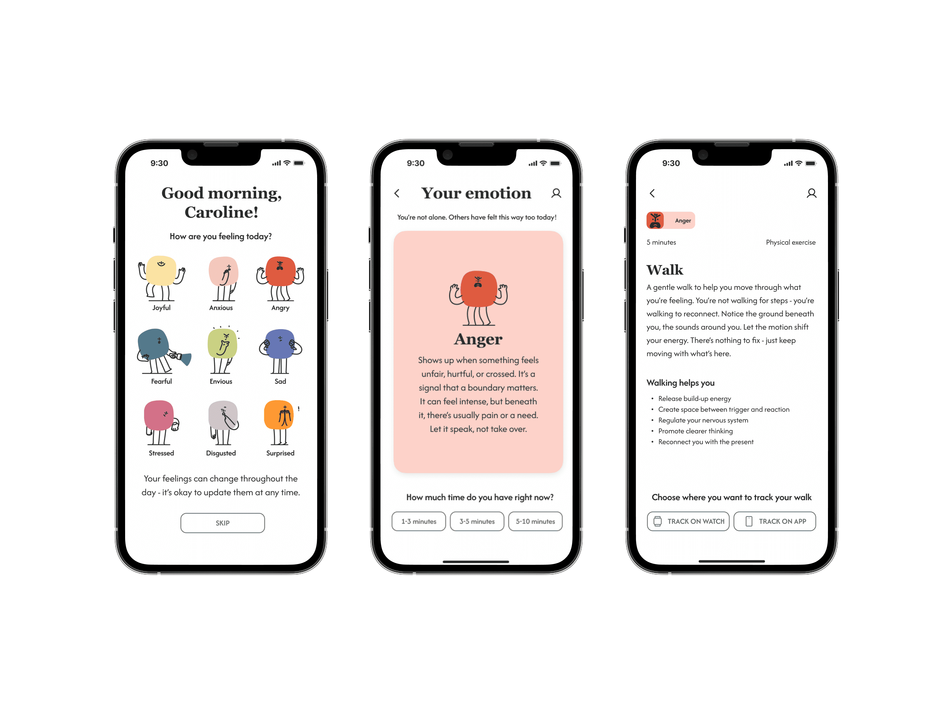
We designed Novem around three principles:
Emotion recognition before action: before suggesting anything, the app helps users identify what they're actually feeling. You can't address an emotion you haven't named.
Adaptable support, not structured routines: exercises are tailored to both the user's emotional state and the time they have available. Three minutes or ten, the app meets users where they are.
Warmth over clinical authority: guidance is expert-backed but delivered in a tone that feels like a trusted friend, not a therapist's waiting room.
The Research
We started with secondary research to understand the emotional landscape before speaking to any users. A study by Dr. Kristen Morie at PubMed Central gave us our first critical insight:
Individuals who struggle to identify their emotions experience significantly more distress when negative feelings arise. That finding shaped every question we took into our interviews.
We interviewed 5 users and surveyed over 20 to understand how people actually process emotions, not just what they said they needed, but what they did when things felt hard.
The data pointed in one direction: users could sense when something was wrong, but most couldn't name what they were feeling.
75% reported feeling overwhelmed at least once a week
Only 36% knew how to recognize when they needed emotional support
53% were actively looking for a calm, non-judgmental space to reset
Three themes emerged: noticing emotions, leaning on support systems, and varied coping mechanisms, but the first drove every subsequent design decision. If users couldn't identify what they were feeling, no exercise or tool would actually help.
To validate this direction, we interviewed a therapist as a subject-matter expert. She confirmed our findings and added a detail that shaped the product fundamentally: there are only 9 core emotions. Everything else we typically label as an emotion is actually a feeling, a more nuanced expression that stems from one of those core nine. That insight became the backbone of Novem, including its name. Novem is Latin for nine.

From the interviews, one primary persona emerged: Caroline, a young professional who recognizes she's overwhelmed but struggles to pinpoint why, and reaches for her phone looking for something that won't add to the noise.
Competitor Analysis
We analyzed Quabble, Finch, Headspace, and BetterHelp, four products covering the range from gamified wellness to professional therapy.
The pattern was consistent: all four assumed users had time, motivation, and emotional clarity before opening the app. None of them met users at the moment of overwhelm.
The gap wasn't a missing feature. It was a missing entry point.
Design Decisions
Every decision in Novem's flow came back to one principle: meet the user where they are, not where the app expects them to be.
Three decisions shaped the experience most:
Emotion recognition as the entry point, research showed that users couldn't access the right support if they couldn't name what they were feeling. Starting the flow with emotion identification wasn't just a UX choice, it was the core function of the product. To make this feel safe and non-judgmental, each of the nine emotions is represented by a character. Users don't have to label themselves clinically, they just find the one that looks like how they feel.
Time as a filter, not an afterthought, emotions don't arrive when it's convenient. They surface mid-commute, between meetings, in the middle of a busy day. Giving users the choice of 3, 5, or 10 minutes before surfacing exercises meant the app could genuinely adapt to real life, not an idealized version of it.
A character-led visual language over a clinical UI, users told us they wanted something that felt like a trusted friend, not a therapist's waiting room. The character-driven aesthetic was a direct response to that. Warmth and approachability weren't stylistic choices, they were functional ones.
The Tests
We tested the prototype with 5 users to see how the emotional-recognition concept actually held up in use, and three clear patterns emerged.
Three iterations came directly from what users experienced:
Refocusing the Home page, having a "completed routines this week" tracker and sleep tracking on the homepage made Novem feel like every other generic wellness app, working against the core premise of helping users first recognize what they were feeling. We removed both, keeping the homepage focused entirely on emotional recognition and the exercises that actually responded to it.

Restructuring the Tools page by exercise type, in the first version, users didn't understand how the filtering connected to the exercises themselves. Breaking the layout down by exercise type made the relationship visible immediately, so users could see what kind of support they were choosing, not just scroll through an unsorted list.

Reorganizing the Journey page through card sorting, rather than guessing at the right structure, we ran a card sorting activity with users and rebuilt the page's information hierarchy based on how they naturally grouped and prioritized the content.
The Impact
Novem was designed as a bootcamp project, but the testing outcomes held up under real use.
None of the issues identified in earlier rounds resurfaced after the two iterations. Users were able to complete the core tasks we gave them, and when asked, they said they would use the app.
For a product built around helping people recognize emotions they often can't name themselves, that willingness to actually use it, not just acknowledge the idea, was the strongest signal that the concept worked.
Reflection
Novem taught me that designing for emotional support means designing for recognition first. Once that core insight became central, the product, the name, even the visual language all followed naturally from it.
If I revisited this project, I'd bring the therapist into the process earlier and keep her involved through usability testing, not just discovery. The exercises themselves deserve the same level of validation we gave the entry point.


Novem
Role
Role
UX Researcher & UI Designer
UX Researcher & UI Designer
Duration
Duration
2 Week Sprint
2 Week Sprint
Tools
Tools
Figma, FigJam & ChatGPT
Figma, FigJam & ChatGPT
Contribution
Contribution
Collaborated equally with two teammates across all phases of research, design, and testing.
Collaborated equally with two teammates across all phases of research, design, and testing.
Most wellness apps are built around consistency, streaks, reminders, routines. But for users already overwhelmed, that kind of structure adds pressure instead of relieving it. Novem was designed around a different premise: what if emotional support felt like something you wanted to reach for, not something you had to keep up with?
The Problem
The wellness app market is crowded, but most tools assume users already know what they're feeling and what they need. Our research told a different story: only 36% of users knew how to recognize when they needed emotional support.
The problem wasn't a lack of wellness tools. It was that existing tools started too late, after users had already lost track of what they were feeling.
The Solution
The solution wasn't another set of exercises or a more polished dashboard. It was a different entry point entirely.
We designed Novem around three principles:
Emotion recognition before action: before suggesting anything, the app helps users identify what they're actually feeling. You can't address an emotion you haven't named.
Adaptable support, not structured routines: exercises are tailored to both the user's emotional state and the time they have available. Three minutes or ten, the app meets users where they are.
Warmth over clinical authority: guidance is expert-backed but delivered in a tone that feels like a trusted friend, not a therapist's waiting room.
The Research
We started with secondary research to understand the emotional landscape before speaking to any users. A study by Dr. Kristen Morie at PubMed Central gave us our first critical insight:
Individuals who struggle to identify their emotions experience significantly more distress when negative feelings arise. That finding shaped every question we took into our interviews.
We interviewed 5 users and surveyed over 20 to understand how people actually process emotions, not just what they said they needed, but what they did when things felt hard.
The data pointed in one direction: users could sense when something was wrong, but most couldn't name what they were feeling.
75% reported feeling overwhelmed at least once a week
Only 36% knew how to recognize when they needed emotional support
53% were actively looking for a calm, non-judgmental space to reset
Three themes emerged: noticing emotions, leaning on support systems, and varied coping mechanisms, but the first drove every subsequent design decision. If users couldn't identify what they were feeling, no exercise or tool would actually help.
To validate this direction, we interviewed a therapist as a subject-matter expert. She confirmed our findings and added a detail that shaped the product fundamentally: there are only 9 core emotions. Everything else we typically label as an emotion is actually a feeling, a more nuanced expression that stems from one of those core nine. That insight became the backbone of Novem, including its name. Novem is Latin for nine.
From the interviews, one primary persona emerged: Caroline, a young professional who recognizes she's overwhelmed but struggles to pinpoint why, and reaches for her phone looking for something that won't add to the noise.
Competitor Analysis
We analyzed Quabble, Finch, Headspace, and BetterHelp, four products covering the range from gamified wellness to professional therapy.
The pattern was consistent: all four assumed users had time, motivation, and emotional clarity before opening the app. None of them met users at the moment of overwhelm.
The gap wasn't a missing feature. It was a missing entry point.
Design Decisions
Every decision in Novem's flow came back to one principle: meet the user where they are, not where the app expects them to be.
Three decisions shaped the experience most:
Emotion recognition as the entry point, research showed that users couldn't access the right support if they couldn't name what they were feeling. Starting the flow with emotion identification wasn't just a UX choice, it was the core function of the product. To make this feel safe and non-judgmental, each of the nine emotions is represented by a character. Users don't have to label themselves clinically, they just find the one that looks like how they feel.
Time as a filter, not an afterthought, emotions don't arrive when it's convenient. They surface mid-commute, between meetings, in the middle of a busy day. Giving users the choice of 3, 5, or 10 minutes before surfacing exercises meant the app could genuinely adapt to real life, not an idealized version of it.
A character-led visual language over a clinical UI, users told us they wanted something that felt like a trusted friend, not a therapist's waiting room. The character-driven aesthetic was a direct response to that. Warmth and approachability weren't stylistic choices, they were functional ones.
The Tests
We tested the prototype with 5 users to see how the emotional-recognition concept actually held up in use, and three clear patterns emerged.
Three iterations came directly from what users experienced:
Refocusing the Home page, having a "completed routines this week" tracker and sleep tracking on the homepage made Novem feel like every other generic wellness app, working against the core premise of helping users first recognize what they were feeling. We removed both, keeping the homepage focused entirely on emotional recognition and the exercises that actually responded to it.
Restructuring the Tools page by exercise type, in the first version, users didn't understand how the filtering connected to the exercises themselves. Breaking the layout down by exercise type made the relationship visible immediately, so users could see what kind of support they were choosing, not just scroll through an unsorted list.
Reorganizing the Journey page through card sorting, rather than guessing at the right structure, we ran a card sorting activity with users and rebuilt the page's information hierarchy based on how they naturally grouped and prioritized the content.
The Impact
Novem was designed as a bootcamp project, but the testing outcomes held up under real use.
None of the issues identified in earlier rounds resurfaced after the two iterations. Users were able to complete the core tasks we gave them, and when asked, they said they would use the app.
For a product built around helping people recognize emotions they often can't name themselves, that willingness to actually use it, not just acknowledge the idea, was the strongest signal that the concept worked.
Reflection
Novem taught me that designing for emotional support means designing for recognition first. Once that core insight became central, the product, the name, even the visual language all followed naturally from it.
If I revisited this project, I'd bring the therapist into the process earlier and keep her involved through usability testing, not just discovery. The exercises themselves deserve the same level of validation we gave the entry point.
Novem
Role
Role
UX Researcher & UI Designer
UX Researcher & UI Designer
Duration
Duration
2 Week Sprint
2 Week Sprint
Tools
Tools
Figma, FigJam & ChatGPT
Figma, FigJam & ChatGPT
Contribution
Contribution
Collaborated equally with two teammates across all phases of research, design, and testing.
Collaborated equally with two teammates across all phases of research, design, and testing.
Most wellness apps are built around consistency, streaks, reminders, routines. But for users already overwhelmed, that kind of structure adds pressure instead of relieving it. Novem was designed around a different premise: what if emotional support felt like something you wanted to reach for, not something you had to keep up with?
The Problem
The wellness app market is crowded, but most tools assume users already know what they're feeling and what they need. Our research told a different story: only 36% of users knew how to recognize when they needed emotional support.
The problem wasn't a lack of wellness tools. It was that existing tools started too late, after users had already lost track of what they were feeling.
The Solution
The solution wasn't another set of exercises or a more polished dashboard. It was a different entry point entirely.
We designed Novem around three principles:
Emotion recognition before action: before suggesting anything, the app helps users identify what they're actually feeling. You can't address an emotion you haven't named.
Adaptable support, not structured routines: exercises are tailored to both the user's emotional state and the time they have available. Three minutes or ten, the app meets users where they are.
Warmth over clinical authority: guidance is expert-backed but delivered in a tone that feels like a trusted friend, not a therapist's waiting room.
The Research
We started with secondary research to understand the emotional landscape before speaking to any users. A study by Dr. Kristen Morie at PubMed Central gave us our first critical insight:
Individuals who struggle to identify their emotions experience significantly more distress when negative feelings arise. That finding shaped every question we took into our interviews.
We interviewed 5 users and surveyed over 20 to understand how people actually process emotions, not just what they said they needed, but what they did when things felt hard.
The data pointed in one direction: users could sense when something was wrong, but most couldn't name what they were feeling.
75% reported feeling overwhelmed at least once a week
Only 36% knew how to recognize when they needed emotional support
53% were actively looking for a calm, non-judgmental space to reset
Three themes emerged: noticing emotions, leaning on support systems, and varied coping mechanisms, but the first drove every subsequent design decision. If users couldn't identify what they were feeling, no exercise or tool would actually help.
To validate this direction, we interviewed a therapist as a subject-matter expert. She confirmed our findings and added a detail that shaped the product fundamentally: there are only 9 core emotions. Everything else we typically label as an emotion is actually a feeling, a more nuanced expression that stems from one of those core nine. That insight became the backbone of Novem, including its name. Novem is Latin for nine.
From the interviews, one primary persona emerged: Caroline, a young professional who recognizes she's overwhelmed but struggles to pinpoint why, and reaches for her phone looking for something that won't add to the noise.
Competitor Analysis
We analyzed Quabble, Finch, Headspace, and BetterHelp, four products covering the range from gamified wellness to professional therapy.
The pattern was consistent: all four assumed users had time, motivation, and emotional clarity before opening the app. None of them met users at the moment of overwhelm.
The gap wasn't a missing feature. It was a missing entry point.
Design Decisions
Every decision in Novem's flow came back to one principle: meet the user where they are, not where the app expects them to be.
Three decisions shaped the experience most:
Emotion recognition as the entry point, research showed that users couldn't access the right support if they couldn't name what they were feeling. Starting the flow with emotion identification wasn't just a UX choice, it was the core function of the product. To make this feel safe and non-judgmental, each of the nine emotions is represented by a character. Users don't have to label themselves clinically, they just find the one that looks like how they feel.
Time as a filter, not an afterthought, emotions don't arrive when it's convenient. They surface mid-commute, between meetings, in the middle of a busy day. Giving users the choice of 3, 5, or 10 minutes before surfacing exercises meant the app could genuinely adapt to real life, not an idealized version of it.
A character-led visual language over a clinical UI, users told us they wanted something that felt like a trusted friend, not a therapist's waiting room. The character-driven aesthetic was a direct response to that. Warmth and approachability weren't stylistic choices, they were functional ones.
The Tests
We tested the prototype with 5 users to see how the emotional-recognition concept actually held up in use, and three clear patterns emerged.
Three iterations came directly from what users experienced:
Refocusing the Home page, having a "completed routines this week" tracker and sleep tracking on the homepage made Novem feel like every other generic wellness app, working against the core premise of helping users first recognize what they were feeling. We removed both, keeping the homepage focused entirely on emotional recognition and the exercises that actually responded to it.
Restructuring the Tools page by exercise type, in the first version, users didn't understand how the filtering connected to the exercises themselves. Breaking the layout down by exercise type made the relationship visible immediately, so users could see what kind of support they were choosing, not just scroll through an unsorted list.
Reorganizing the Journey page through card sorting, rather than guessing at the right structure, we ran a card sorting activity with users and rebuilt the page's information hierarchy based on how they naturally grouped and prioritized the content.
The Impact
Novem was designed as a bootcamp project, but the testing outcomes held up under real use.
None of the issues identified in earlier rounds resurfaced after the two iterations. Users were able to complete the core tasks we gave them, and when asked, they said they would use the app.
For a product built around helping people recognize emotions they often can't name themselves, that willingness to actually use it, not just acknowledge the idea, was the strongest signal that the concept worked.
Reflection
Novem taught me that designing for emotional support means designing for recognition first. Once that core insight became central, the product, the name, even the visual language all followed naturally from it.
If I revisited this project, I'd bring the therapist into the process earlier and keep her involved through usability testing, not just discovery. The exercises themselves deserve the same level of validation we gave the entry point.